iOS 15 review: Focus mode, FaceTime web links and live text are game-changers
Whether you're getting Apple's new iPhone 13 or holding onto a 6-year-old iPhone 6S, iOS 15 is now available for download. The new operating system was in public beta for months undergoing a variety of tweaks leading to its final release. I've been testing iOS 15's new features, and everything from bigger additions like FaceTime call web links for friends on Android and Windows to smaller changes like pinning conversations to the top of the Messages app has improved my iPhone -- without disrupting my day.
On the whole, iOS 15 feels like a continuation of iOS 14, which felt like a continuation of iOS 13. These three updates are like a movie trilogy, but unlike The Lord of the Rings there isn't an ominous Eye of Sauron looming over your every move, just Siri. Following in the smart footsteps of iOS 13 and 14, iOS 15 lets you decide how much you want to change your iPhone experience. For instance, in Safari the tab bar can be moved to the bottom of your phone's screen to make it easier to reach one-handed. If you want that tab bar back at the top where it's been since 2007, you can tap the AA button and select Show Top Address Bar.
Visually, iOS 15 doesn't alter the way your phone looks, or at least not in a big way. This isn't like the drastic overhaul seen going to iOS 7 from iOS 6. Also, iOS 15 isn't defined by a couple of giant flashy features. Instead, it's made up of hundreds of small and medium additions that add up to something more significant. From more ways to personalize your Memoji to the larger visual improvements in Maps, iOS 15 is a vast overhaul of your phone. But instead of trumpeting its changes like a parade of elephants, Apple has quietly tip-toed in improvements to help make your phone better without inconveniencing your existing preferences and workflows.
Read more: iOS 15's hidden tricks are its best features. Here's what we've found so far
When it comes to device support, Apple's iOS is simply unmatched. If you have an iPhone 6S or the original iPhone SE, iOS 15 will work on your phone. You just might not get all of the new additions. Compare that with Android phones. I can't think of a 2015 phone from Google, Samsung or Huawei that will be able to run Android 12.
With all of that out of the way, let's get into a few of my favorite features.
Focus mode in iOS 15 is transformative
Out of everything in iOS 15, Focus mode had the biggest impact on me. Several colleagues describe it as "Do Not Disturb mode on steroids." Focus lets you filter notifications based on what you're currently doing, and organize app and widget pages on your iPhone's home screen to match your activity and state of mind.
With a Focus mode enabled, your status is automatically displayed in Messages for friends to see. It's kind of like setting an Away status on Slack, but to remind others not to interrupt you. The difference is that a Focus status works system wide across your iPhone, Mac and other devices. You also have the ability to turn off your Focus status so it's not shared.
Third-party app developers can incorporate Focus status in their messaging apps if they choose. This leads to the possibility that your Focus status could work with WhatsApp, Signal or others in the future. Slack will support Focus status when iOS 15 is released.
Setting up or editing a Focus is easily done in Settings. I set up a handful of Focuses including default ones for work and fitness. I made a couple of custom Focuses for cooking and cycling. You can name the Focus anything you like so please don't judge my rather bland naming scheme for cooking and cycling. You can schedule a Focus to start and end at a certain time or be triggered when you arrive at a location, or you can use Control Center to toggle them on and off at will.

When you set up a Focus you can select who can notify you. For my work focus, I limit contact to my boss and co-workers. Like in Do Not Disturb mode, you'll still receive all your messages and calls, but you'll only be alerted to the ones from the contacts you specified. Contacts I didn't specify who try to reach me when I'm using Focus are alerted above the text field in Messages that my notifications are silenced. There is an option for them to "Notify anyway" that will alert me.
You can customize which app pages from your home screen are displayed during a specific Focus. I made an app page that was just for apps I use during work. On it are apps like Slack, Filmic Pro, Voice Memos and a teleprompter app. I left off apps that I knew would distract me like Instagram and Twitter.
When I turn on my work focus, my normal four pages of home screen apps goes down to the one I selected. Since iOS lets you duplicate an app multiple times across different pages on your home screen, you have an infinite amount of possibilities for customization. If I want Slack to be on an app page with work apps, and another app page for commuting, I can do that. It's also worth remembering that Focus doesn't delete or disable the apps you're not using. If I'm in my work Focus and need to hop onto Twitter, I can still access it along with every app on my iPhone via the App Library.
It took a while to get Focus set up and tweaked just right. And if you have a Mac running MacOS Monterey, you might have more finessing to do to make Focus work for you. Focus mode has improved how I use my phone. I feel more purposeful.
Now playing:Watch this: We found these amazing features in the iOS 15 beta17:38Portrait mode for FaceTime calls looks great
Portrait mode is not just for your photos anymore. iOS 15 lets you turn on Portrait mode for your FaceTime calls, bringing with it the ability to place an artistic blurry background behind you. Zoom, Skype and other video chat apps allow you to place a blur around you, but Apple's implementation looks so much better and more natural. Instead of being a wall of blur, Portrait mode mimics the natural out-of-focus falloff you get using a mirrorless camera and fast lens. FaceTime Portrait mode lacks the jagged cutout or a weird halo effect I often see on Zoom. When I tested the feature out, one friend asked if I'd gotten a new phone because the effect looked so good.
When you couple Portrait mode along with the spatial audio feature in FaceTime, video calls become even more immersive. Spatial audio grounds the location of the audio source relative to you. Obviously all of the callers are on your phone, but spatial audio spreads them out so they sound like they're talking to you from your left and right as well as middle. It's a really neat effect. I noticed it worked best on calls with four people or more.
Notification Summary removes the noise from your iPhone
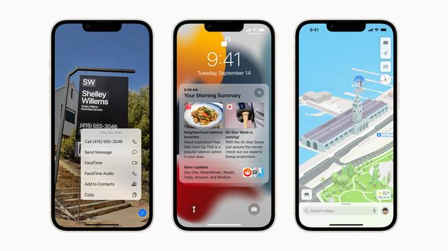
Notification Summary is like your own personalized dossier filled with curated notifications that aren't timely or urgent. App notifications can be overwhelming. Up to now managing your notifications has been in large part an all or nothing affair. But iOS 15 allows you to gather useful notifications in one place where you can view them at your own choosing.
For me, instead of constantly being interrupted or distracted even for a moment, Notification Summary collects notifications from apps that I'm interested in but that are not urgent. Then it delivers that collection of notifications to me when I want.
Notification Summary is great for handling those notifications you want but necessarily don't need to see right away. A good example would be a notification from a game letting you know of an upgrade or, in my case, the New York Times Crossword app alerting me to a new puzzle (OK, that one could be considered urgent).
Notification Summary really changed my relationship with my iPhone. I found myself now allowing notifications from apps I previously opted out of because now I can better manage them.
Live Text is a fantastic way to input text, numbers and websites
When Live Text first came out, I was like, "Oh, it's Apple's version of Google Lens." Yes, they live on the same spectrum but are different. Google Lens is more like Live Text and iOS Spotlight combined. You can use Live Text in real time with your camera or with photos to identify text. It automatically detects if text is present and contextualizes it. And it works with both printed text and handwriting.
If there's a phone number, you can tap it to dial the number. If there is a Spanish word you can translate it to English. If you have a photo, just tap the Live Text icon on the bottom right to interact with any text in the frame. The interface looks clean and is easy to use. One of my favorite examples was when Live Text identified text on a wrinkled T-shirt I was wearing in a photo.
iOS 15 features not available at launch
There are several iOS 15 features that won't be available at launch, but I want to highlight two. The first is the ability to add identification cards like your driver's license to your iPhone's wallet. When I first heard about this feature I was skeptical. But after losing my wallet, I wish I had my driver's license in my iPhone's Wallet app as a backup.
The other thing I'm excited about is SharePlay. When you're on a FaceTime call, SharePlay lets you listen to music or watch a movie or TV show together and in sync with your friends. You can even share your screen. I tried the feature out in an early beta version of iOS 15 and was impressed with the potential. It's a little bit like a number of group video-watching features added to apps like Hulu, Prime Video and Disney Plus over the course of the pandemic, mixed with screen sharing over a Zoom call. The difference is that SharePlay is better integrated across your phone and not limited to just a couple of app. You can use it for TikTok, sharing music and any other app that opts in to use SharePlay. It has a clean interface that even allows you to broadcast SharePlay media from your phone to a TV equipped with an AppleTV device.
Walk don't run to iOS 15
Overall, these numerous additions and changes led to a positive experience with iOS 15. As with any software update, I'd recommend backing up your phone beforehand as a precaution. Those with older iPhones also might want to wait a few days to see if other people report problems they encounter.


